- percentiles
- performance
- observability
Understanding API Percentiles (p50, p95, p99) and Why They Matter
Your API's average response time is 100 milliseconds. Your dashboards are green. Your status page says "all systems operational". And yet, every week, a handful of users file support tickets about the app being "really slow".
They aren't wrong. You just aren't measuring what they're experiencing.
Averages lie. Not because they're computed incorrectly, but because they summarize away the worst thing your API does to the worst-off users. This post explains what API latency percentiles are, why p50 / p95 / p99 are the numbers that matter, and how to act on them. Along the way, a visualization of what's actually happening in your response-time distribution.
Why averages lie
Averages assume your response times cluster neatly around a central value, like heights in a population, or weights of apples. API latency doesn't work that way. API latency distributions are long-tailed: most requests are fast, a meaningful minority are much slower, and a small but nonzero slice is catastrophically slow.
Here's what a real API's response-time distribution looks like. The horizontal axis is response time in milliseconds. The vertical axis is how often each response time occurs.
Three things to notice:
- Most requests are fast. The big hump on the left, where most requests finish under 100ms. That's the experience the "average" tracks.
- The tail is long. A small number of requests take 500, 700, 800ms or more. These are also real user experiences.
- The mean is pulled right by the tail. With a long tail, the arithmetic mean sits somewhere around 120 to 150ms, above the median but below the bulk of the tail. It describes no one's experience correctly.
Your p99 (the latency only 1% of requests exceed) might be ten times your p50. That "10x factor" is invisible if you only ever look at the average.
What p50, p95, and p99 actually mean
A percentile is a cut point: "p95 is 350ms" means "95% of requests finished in 350ms or less, 5% took longer".
The three percentiles you'll use 99% of the time:
- p50 (median). Half your requests are faster, half are slower. This is the "typical" user experience. If your p50 is 80ms, the average user feels your API as an 80ms thing.
- p95. 95% of requests finish in this time or less. 5%, or one in twenty, experience worse. On a site with a million daily requests, that's 50,000 slow experiences a day. p95 is usually where mobile and high-latency network users live.
- p99. 99% of requests are faster. The worst 1%. On a high-traffic API that's still tens of thousands of worst-case experiences per day. p99 is where GC pauses, cold caches, noisy neighbors, and cascading retries show up.
Two less common but occasionally useful percentiles:
- p99.9. The worst 0.1%. If you're running a system with strict SLAs or doing capacity planning for a very large service, p99.9 starts to matter. Below that scale, the noise usually exceeds the signal.
- Max. The single slowest request in your window. Tempting to stare at, but usually reflects an unrelated event (a deploy, a GC, a network blip). Useful for alerting on pathological events, not for tracking trends.
What the long tail is actually hiding
If your p99 is 10x your p50, something specific is happening in that tail. The usual suspects:
Database. A missing index, a table that's grown past its cached hot set, a lock that briefly blocks writes. Reads that "should" hit the cache hit disk instead and fall off a cliff.
Garbage collection or runtime pauses. In JVM, Node, Python, Go, or any other runtime with garbage collection, full GC cycles can pause execution for tens to hundreds of milliseconds. They show up as clumps of slow requests from otherwise-fast instances.
Cold caches. The first request to hit a given cache key, region, or instance after a restart or deploy takes the full unpenalized path. Your p99 can be "the first request of the minute".
Noisy neighbors. On shared infrastructure, someone else's spike pins CPU, disk, or network briefly. Your service pays the cost in tail latency.
Retries and fallback paths. When a downstream service flakes, your retry logic adds its full budget (often 100–500ms per retry) to the request's apparent latency.
Connection pool saturation. Under concurrency, requests wait for an available connection before work begins. This shows up as a p95 / p99 gap that grows faster than linear with load.
A healthy p50 with an ugly p99 usually means one of these. Fix it, and p99 collapses toward p95 in days.
Choosing the right percentile for your use case
Not every service cares about every percentile equally. A rough mental model:
- Interactive user-facing APIs. Track p50 and p95. p50 for your "typical user" story; p95 for the worst tolerable experience.
- Payments, checkouts, anything revenue-critical. p99 is your operating metric. A 1% failure rate on a checkout is a real money problem.
- Background jobs, ETL, async pipelines. p95 or mean are usually fine. Nobody's waiting on a response, so a tail of slow jobs doesn't degrade UX.
- Tight SLAs. p99.9 is often contractual. If you're operating at that level, you already know.
A common mistake: tracking p50 as your alerting metric. A big regression in the tail can double your p99 without moving p50 at all. You'll find out from user tickets before you find out from your dashboard.
How to actually measure percentiles
Percentiles are straightforward to compute: sort your response times, pick the right index. The subtlety is which response times you're sorting.
Three rules of thumb:
- Measure from the user's perspective when possible. Server-side latency misses network, TLS, client-side parsing. For real-user performance, instrument the client. For service-level health, server-side is fine.
- Aggregate percentiles carefully. You cannot take the p95 from two different servers and average them to get the "overall" p95. The math doesn't work. Use a histogram-aware aggregation (HDR histograms are the common solution), or measure from a single aggregation point.
- Measure at the right bucket size. Percentiles over a day smooth out the spikes that wake users up. Percentiles over a minute can be too noisy. 5-minute or 1-hour windows are usually the sweet spot for alerting.
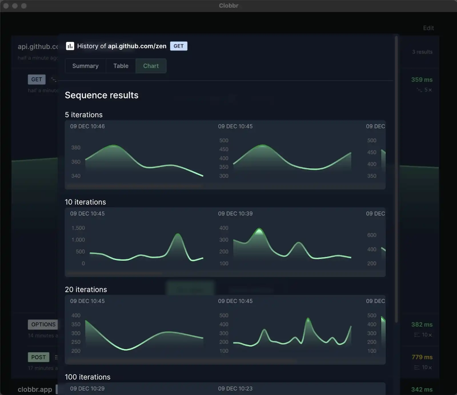
For one-off measurements during development or capacity planning, a focused load test over a few minutes gives you a clean distribution. Tools like Clobbr show per-run percentiles in the result view, so you can see how p95 and p99 move between commits without wiring up infrastructure.
For production monitoring, most modern observability tools (Datadog, New Relic, Honeycomb, Grafana + Prometheus with histogram types) can compute percentiles over arbitrary windows. If your current dashboards only report averages, fixing that is a 20-minute job with outsized payoff.
Acting on percentile data
A few specific moves once you've got percentiles in front of you.
p95 or p99 regressed on the last deploy. Read the diff. If it's a database query change, EXPLAIN it on production data. If it's a new downstream call, check what that service's own p99 looks like. Regressions in the tail are almost always caused by a specific change, not by general drift.
p99 is 5x or 10x your p50 but stable over time. You have a chronic tail-latency source. The fix is usually capacity or architecture: connection pool sizing, caching strategy, retry budgets. Improving p99 in this state is high-leverage but not urgent.
p99 is noisy day-to-day. Your tail is event-driven. Look for correlations with deploys, scheduled jobs, traffic spikes, or downstream incidents. A tail that jumps on specific hours or after specific events is a scheduling or capacity problem.
p50 regressed too. The regression is hitting everyone, not just the tail. This is usually easier to root-cause; it's the typical path, not the pathological one. Bisect recent changes, check the dashboard for resource saturation.
Nothing's moving but users are still complaining. You're not measuring what they're experiencing. Check whether your percentiles include network time, TLS, client parsing. Consider adding real-user monitoring (RUM) if you don't have it.
Further reading
The definitive talk on this topic is Gil Tene's "How NOT to Measure Latency", which is required viewing if you're going to spend a career looking at these numbers. He explains the specific ways naïve percentile calculations lie and introduces the HDR histogram. The 45 minutes are worth it.
Two practical tips we keep coming back to:
- Every time you see an average latency number, mentally append "and the p99 is probably 5–10x worse". Usually right. Forces better questions.
- When reporting performance to a non-technical audience, pair p95 with a concrete example: "95% of our customers see a sub-200ms response; the slowest 5% experience up to 450ms". People understand the story better than the number.
Wrapping up
Averages hide the worst experiences your API delivers. Percentiles expose them. The mental shift, from "how fast is my API on average" to "how fast is my API for the unluckiest 5%", is the difference between dashboards that go green when users are suffering and dashboards that actually match reality.
Start with p95. If it's more than 2–3x your p50, you have a tail. Fix it, and your users feel the difference before your graph does.